CSS
css实现“加号”效果的实例代码
发布时间:2022-04-13 发布网站:脚本宝典
脚本宝典收集整理的这篇文章主要介绍了css实现“加号”效果的实例代码,脚本宝典觉得挺不错的,现在分享给大家,也给大家做个参考。
实现下图的加号效果:

若想实现这个效果, 只需一个div元素即可搞定。
需要用到css的为了before和after, 以及border特性。
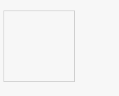
先设置一个div便签
<div class="add"></div>
再设置一个边框:
.add {
  border: 1px solid;
  width: 100px;
  height: 100px;
  color: #ccc;
  transITion: color .25s;
  position: relative;
}
此时边框是这样的:
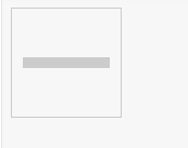
我们可以利用伪类before和其border-top来设置一个“横”:
.add::before{
  content: '';
  position: absolute;
  left: 50%;
  top: 50%;
  width: 80px;
  margin-left: -40px;
  margin-top: -5px;
  border-top: 10px solid;
}
注意我们使了绝对定位。 此时变成了这样:
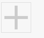
参照上面, 我们可以使用after伪类和border-bottom设置一个“竖”:
.add::after {
 content: '';
 position: absolute;
 left: 50%;
 top: 50%;
 height: 80px;
 margin-left: -5px;
 margin-top: -40px;
 border-left: 10px solid;
}
在加上hover伪类,设置鼠标悬浮上去的颜色:
.add:hover {
  color: blue;
}
最终的样式:
当鼠标悬浮上去是, 会变色:
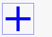
大家可以在这里查看效果:
https://jsbin.com/quvidap/edit?html,css,output
总结
以上所述是小编给大家介绍的css实现“加号”效果的实例代码,希望对大家有所帮助,如果大家有任何疑问请给我留言,小编会及时回复大家的。在此也非常感谢大家对脚本宝典网站的支持!
脚本宝典总结
以上是脚本宝典为你收集整理的css实现“加号”效果的实例代码全部内容,希望文章能够帮你解决css实现“加号”效果的实例代码所遇到的问题。
本图文内容来源于网友网络收集整理提供,作为学习参考使用,版权属于原作者。
如您有任何意见或建议可联系处理。小编QQ:384754419,请注明来意。
猜你在找的CSS相关文章
- css怎么控制按钮不可用 2022-05-17
- css3中transform属性实现的4种功能 2022-04-13
- 纯CSS3实现div按照顺序出入效果 2022-04-13
- CSS实现隐藏搜索框功能(动画正反向序列) 2022-04-13
- 使用CSS3实现按钮悬停闪烁动态特效代码 2022-04-13
- CSS3 Tab动画实例之背景切换动态效果 2022-04-13
- CSS实现两列布局的N种方法 2022-04-13
- CSS 实现Chrome标签栏的技巧 2022-04-13
- css实现两栏布局,左侧固定宽,右侧自适应的多种方法 2022-04-13
- 从QQtabBar看css命名规范BEM的详细介绍 2022-04-13
全站导航更多
html5HTML/XhtmlCSSXML/XSLTDreamweaver教程Frontpage教程心得技巧JavaScriptASP.NETPHP编程正则表达式AJAX相关ASP编程JSP编程编程10000问CSS/HTMLFlexvbsDOS/BAThtahtcpythonperl游戏相关VBA远程脚本ColdFusionMsSqlMysqlmariadboracleDB2mssql2008mssql2005SQLitePostgreSQLMongoDB星外虚拟主机华众虚拟主机Linuxwin服务器FTP服务器DNS服务器Tomcatnginxzabbix云和虚拟化bios系统安装系统系统进程Windows系列LINUXRedHat/CentosUbuntu/DebianFedoraSolaris红旗Linux建站经验微信营销网站优化网站策划网络赚钱网络创业站长故事alexa域名photoshop教程摄影教程Fireworks教程CorelDraw教程Illustrator教程Painter教程Freehand教程IndesignSketch笔记本主板内存CPU存储显卡显示器光存储鼠标键盘平板电脑安全教程杀毒防毒安全设置病毒查杀脚本攻防入侵防御工具使用业界动态Exploit漏洞分析
最新CSS教程