三步用CSS写一个商城卡券
脚本宝典收集整理的这篇文章主要介绍了三步用CSS写一个商城卡券,脚本宝典觉得挺不错的,现在分享给大家,也给大家做个参考。
今天是618 ,各大商城都在搞促销活动,今天我们就来用css做一个商城卡卷,具体如下:
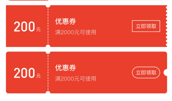

还在为上面这样格式各样的商城卡券的样式而发愁?CSS 不熟,canvas 太难,怎么办?
用 CSS 写一个商城卡券需要几步?
一共需要三步:
- 打开这个网址(浏览器输入 https://qishaoxuan.github.io/css_tricks/hollowOut/ )
- 找到需要的样式
- 复制粘贴
交给测试后,我们来分析下 CSS 卡券。
我们来准备一下基础知识
radial-gradien:
| 值 | 描述 |
|---|---|
| shaPE | 确定圆的类型: ellipse (默认): 指定椭圆形的径向渐变。 circle :指定圆形的径向渐变 |
| size | 定义渐变的大小 |
| position | 定义渐变的位置 |
这样,我们能很容易写出一个居中的圆形背景图
.center-circle {
    width: 100px;
    height: 100px;
    background: radial-gradient(circle at 50px 50px, transparent 10px, #00adb5 0);
  }
linear-gradient
background: linear-gradient(direction, color-stop1, color-stop2, ...);
| 值 | 描述 |
|---|---|
| direction | 用角度值指定渐变的方向(或角度) |
| color-stop1, color-stop2,... | 用于指定渐变的起止颜色 |
我们不需要知道具体的渐变过程,只要写一个简单的,写一个使用渐变属性而不渐变背景图即可:
.linear-gradient {
    width: 100px;
    height: 100px;
    background: linear-gradient(to right, #00adb5, #00adb5);
  }
background
background 是可以设置多个图片的,遵循 background: [background-color] [background-image] [background-repeat] [background-attachment] [background-position] / [ background-size] [background-origin] [background-clip]; 使用 , 隔开即可。
开始组合基础知识
写一个最简单的

只要把上述中心圆示例的圆形位置定位在左侧即可
.left-circle{
  width: 100px;
  height: 100px;
  position: relative;
  background: radial-gradient(circle at 0 50px, transparent 10px, #00adb5 0) top left/100px 100% no-repeat;
}
进一步学习

你可还记得 background 是有 repeat 属性吗?也就是说我们只要设置一部分样式,再使用 repeat 即可,看下图片,这不就是一个不渐变的 linear-gradient 和 radial-gradient 的组合吗,再借助伪类,我们即可写出来了。
.hollow-circles {
  width: 300px;
  height: 100px;
  position: relative;
  background: #00adb5;
  margin-bottom: 10px;
}
.hollow-circles::after {
  content: '';
  position: absolute;
  height: 5px;
  width:100%;
  left: 0;
  bottom: -5px;
  background-image: linear-gradient(to right, #00adb5 5px, transparent 5px, transparent),
  radial-gradient(10px circle at 10px 5px, transparent 5px, #00adb5 5px);
  background-Size: 15px 5px;
}
复杂一点

看见很简单,不就是刚才那个圆再画一个吗,但是要考虑到两侧的颜色是不同的,所以我们需要画四个背景图才行,将每个圆定位在方形的各个角落,然后组合在一起即可。
.two-circles {
  width: 300px;
  height: 100px;
  background: radial-gradient(circle at right top, transparent 10px, #00adb5 0) top left / 60px 51% no-repeat,
    radial-gradient(circle at right bottom, transparent 10px, #00adb5 0) bottom left /60px 51% no-repeat,
    radial-gradient(circle at left top, transparent 10px, #eeeeee 0) top right /240px 51% no-repeat,
    radial-gradient(circle at left bottom, transparent 10px, #eeeeee 0) bottom right /240px 51% no-repeat;
}
以上就是本文的全部内容,希望对大家的学习有所帮助,也希望大家多多支持脚本宝典。
脚本宝典总结
以上是脚本宝典为你收集整理的三步用CSS写一个商城卡券全部内容,希望文章能够帮你解决三步用CSS写一个商城卡券所遇到的问题。
本图文内容来源于网友网络收集整理提供,作为学习参考使用,版权属于原作者。
如您有任何意见或建议可联系处理。小编QQ:384754419,请注明来意。
- css怎么控制按钮不可用 2022-05-17
- css3中transform属性实现的4种功能 2022-04-13
- 纯CSS3实现div按照顺序出入效果 2022-04-13
- CSS实现隐藏搜索框功能(动画正反向序列) 2022-04-13
- 使用CSS3实现按钮悬停闪烁动态特效代码 2022-04-13
- CSS3 Tab动画实例之背景切换动态效果 2022-04-13
- CSS实现两列布局的N种方法 2022-04-13
- CSS 实现Chrome标签栏的技巧 2022-04-13
- css实现两栏布局,左侧固定宽,右侧自适应的多种方法 2022-04-13
- 从QQtabBar看css命名规范BEM的详细介绍 2022-04-13